Strategic framing
I built a framework before I opened Figma.
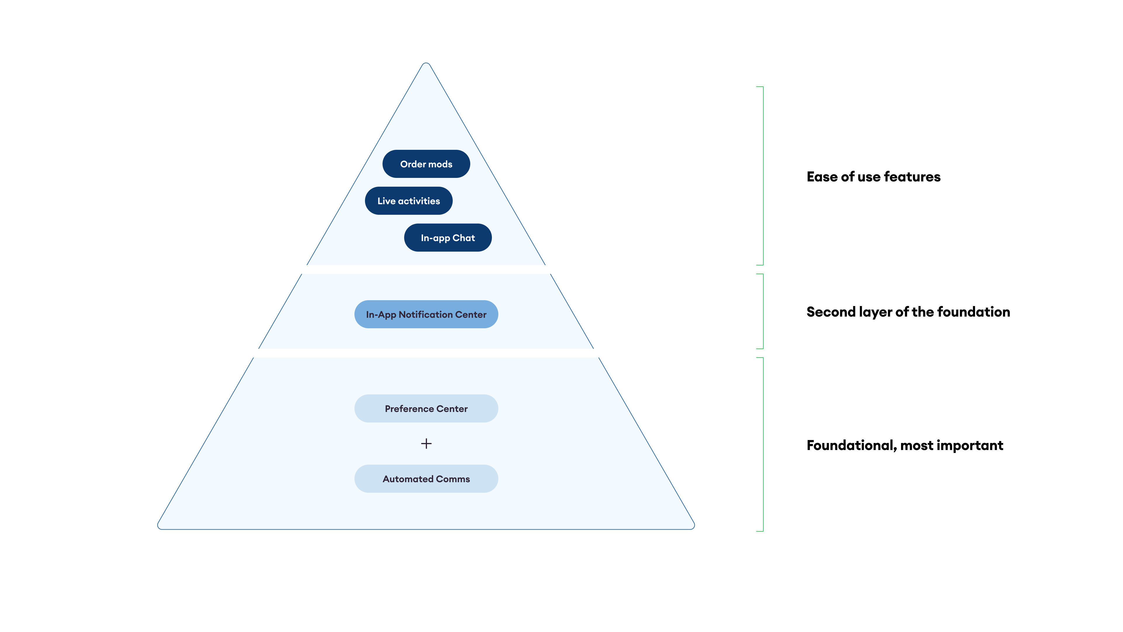
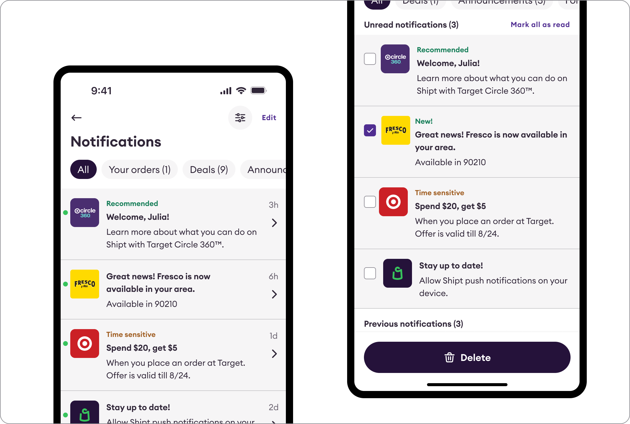
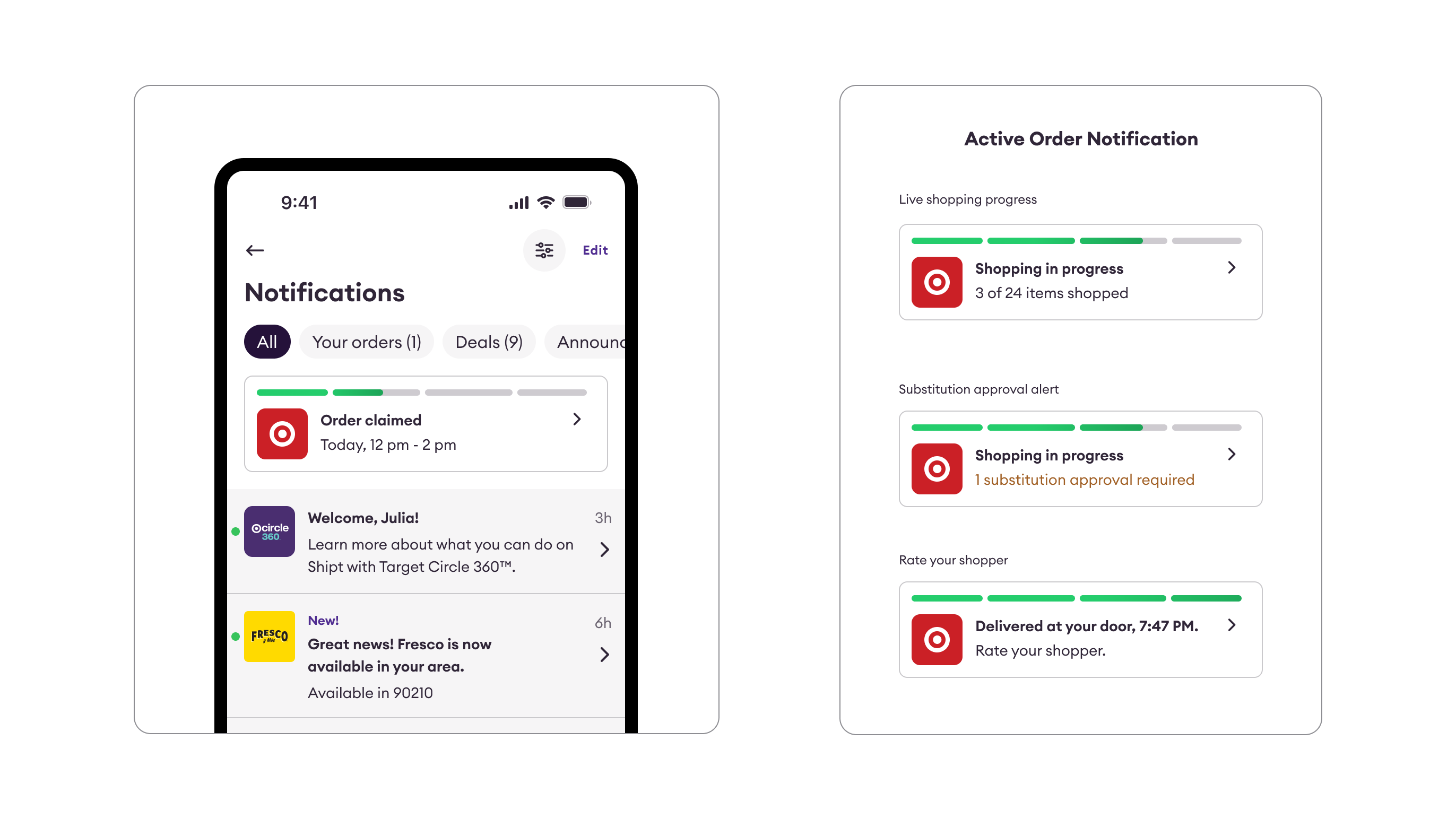
Before opening Figma, I needed to define what belongs, how it's prioritized, and how any team could ship without a design review. I led a cross-functional brainstorm to surface every notification type, then organized them into five buckets ranked by urgency and user value.
Bucket 1
Bucket 2
Bucket 3
Bucket 4
Step 1
Listing use cases and organizing them in buckets
We started by listing every type of notification the platform could send. We ran a cross-functional brainstorm with Product & Marketing, then grouped all use cases into named buckets.
Highest priorityBucket 4
Bucket 2
Bucket 1
Lowest priorityBucket 3
Step 2
Ranking the Buckets
We arranged the buckets from most to least important based on urgency and member value — creating a clear priority hierarchy that content decisions could map to.
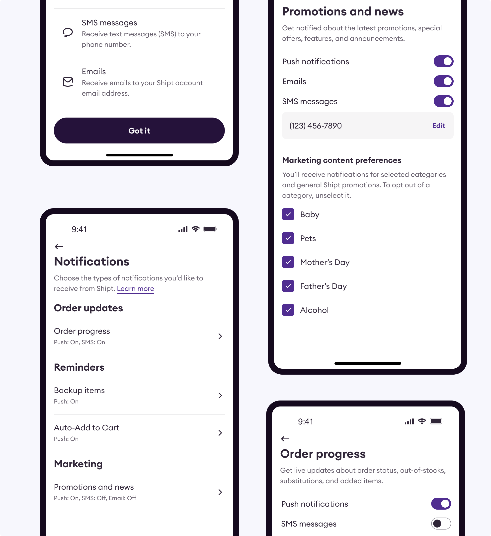
Notification body
CTA #1
CTA #2
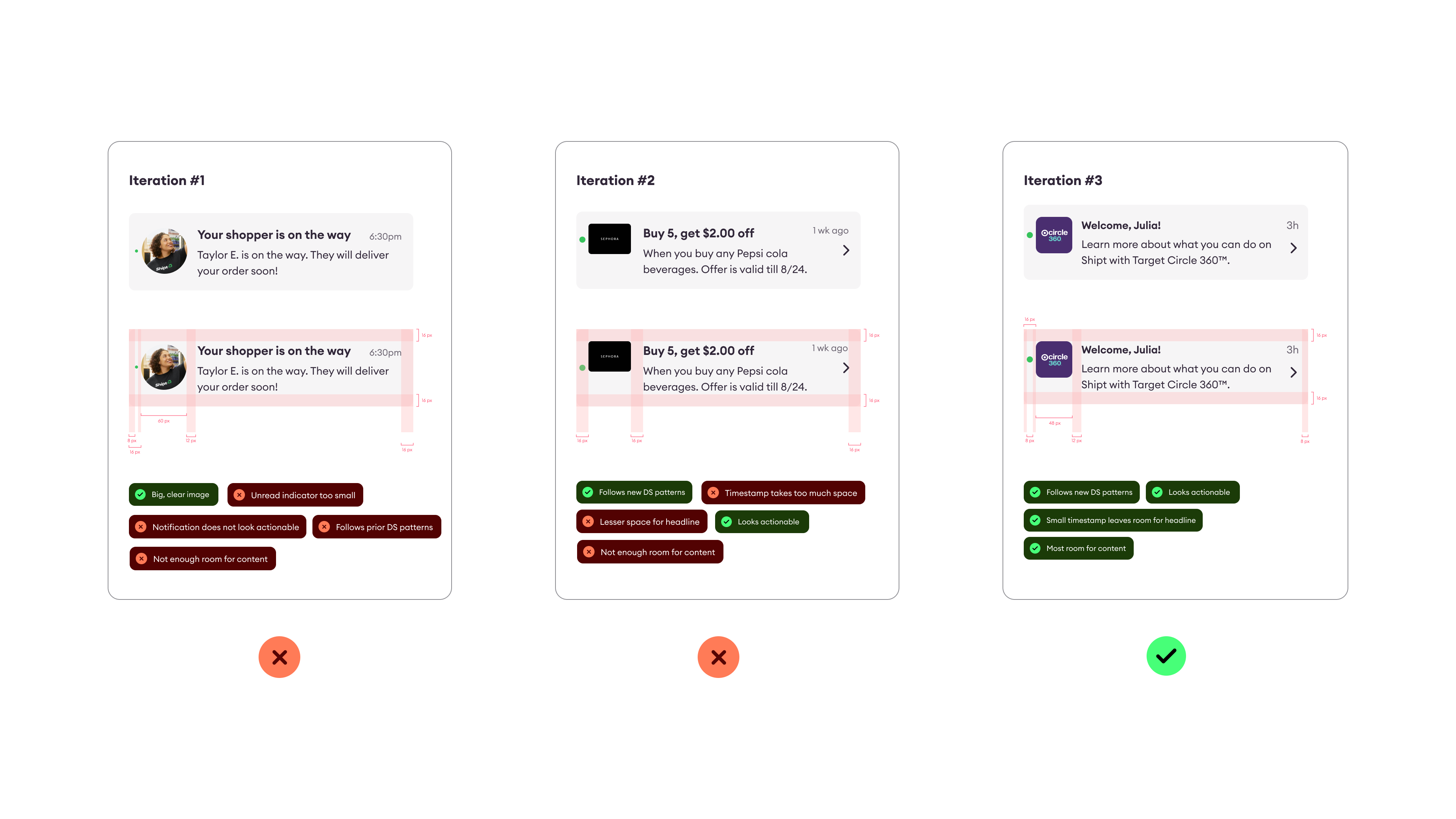
Step 3
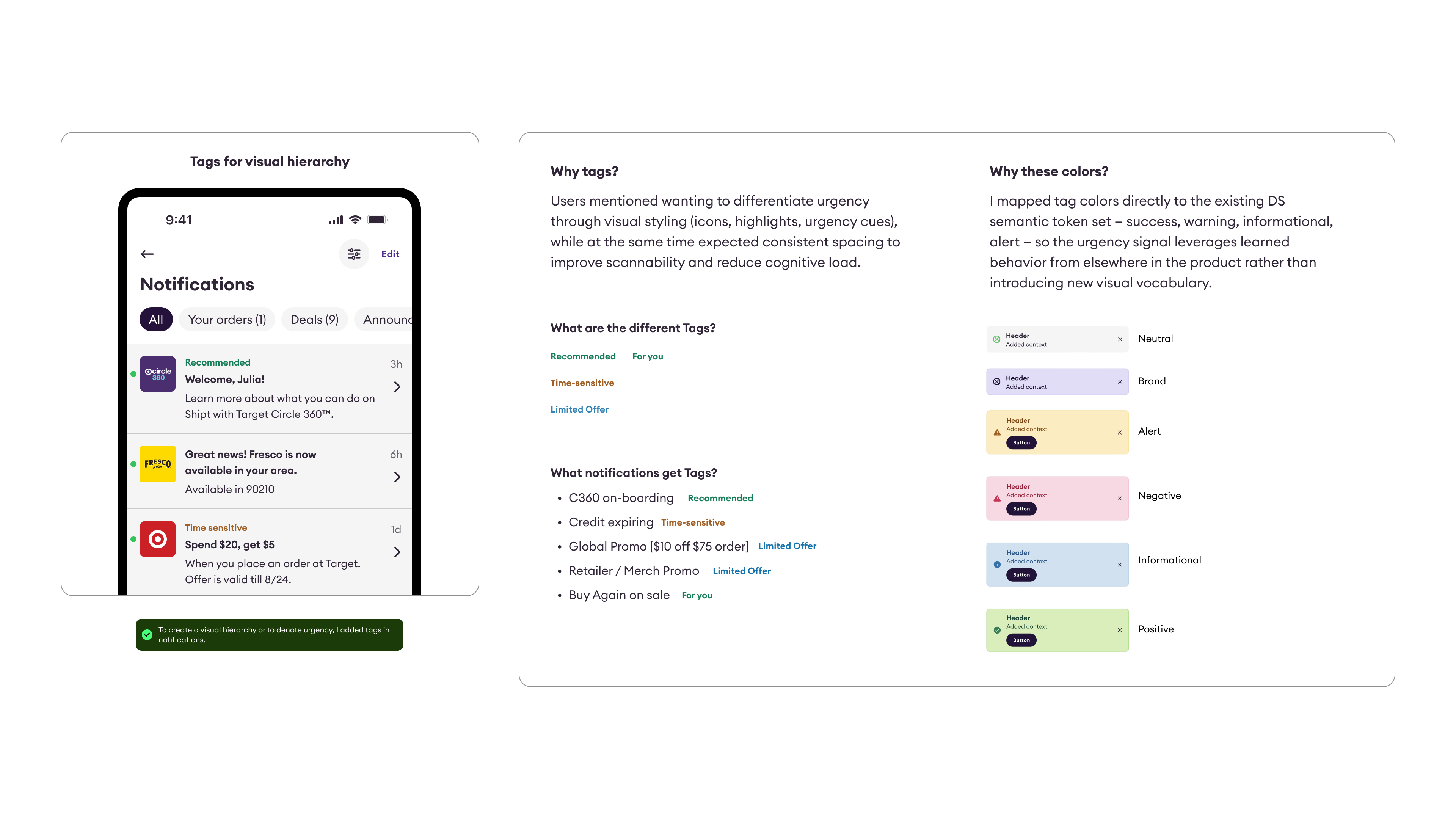
Template System
Defining reusable notification components per bucket so any team can add to the center without needing a design review from scratch.