Making Savings Easier to Find, Understand, and Use.
Customers struggled to understand and use savings due to a fragmented experience. I identified key gaps and created a unified approach that made savings easier to find, understand, and redeem.
Customers struggled to understand and use savings due to a fragmented experience. I identified key gaps and created a unified approach that made savings easier to find, understand, and redeem.
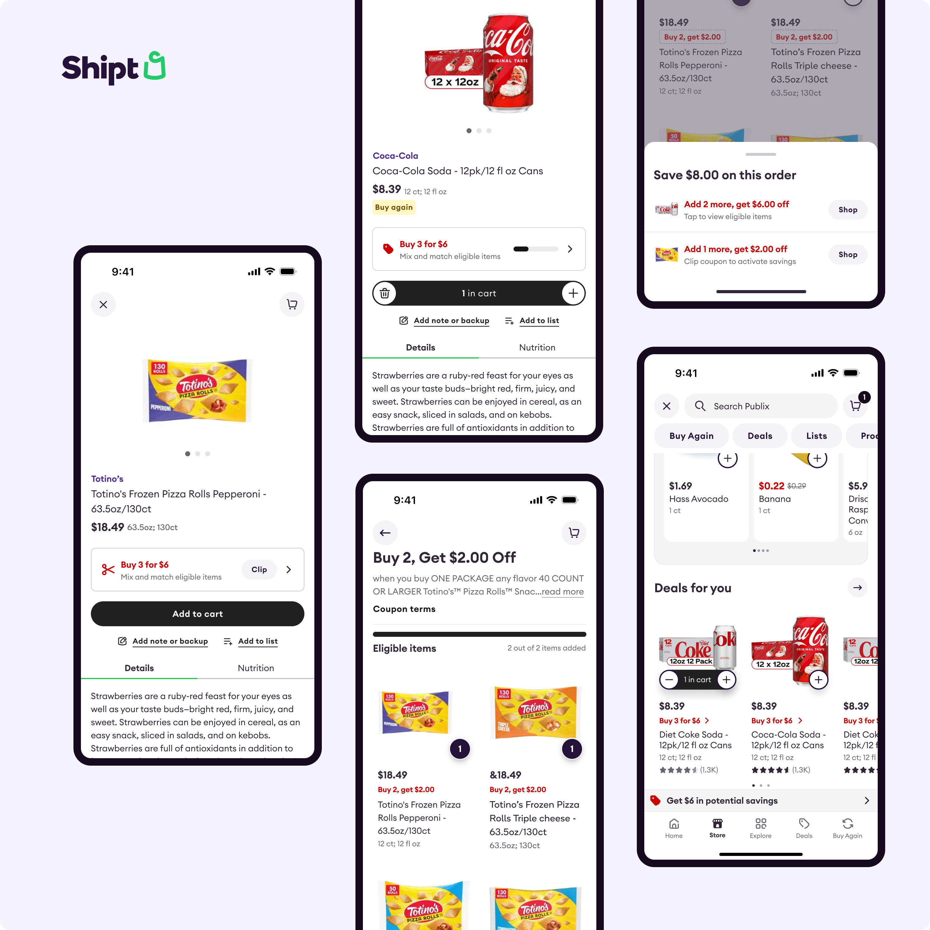
Savings were hard to find, inconsistent to use, and difficult to track.
Customers had to go through multiple steps to find eligible deals, with different paths for promotions and coupons—making savings hard to discover unless they already knew where to look.
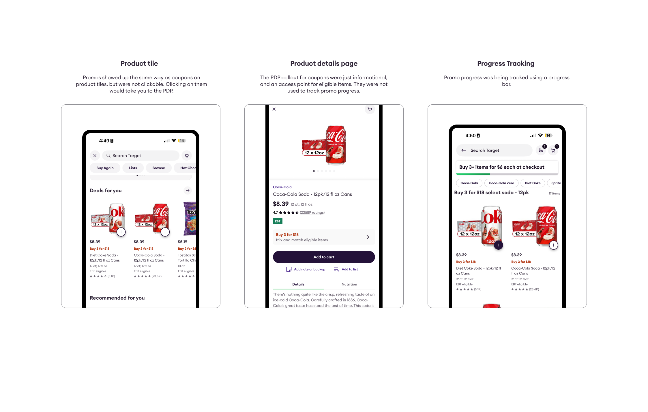
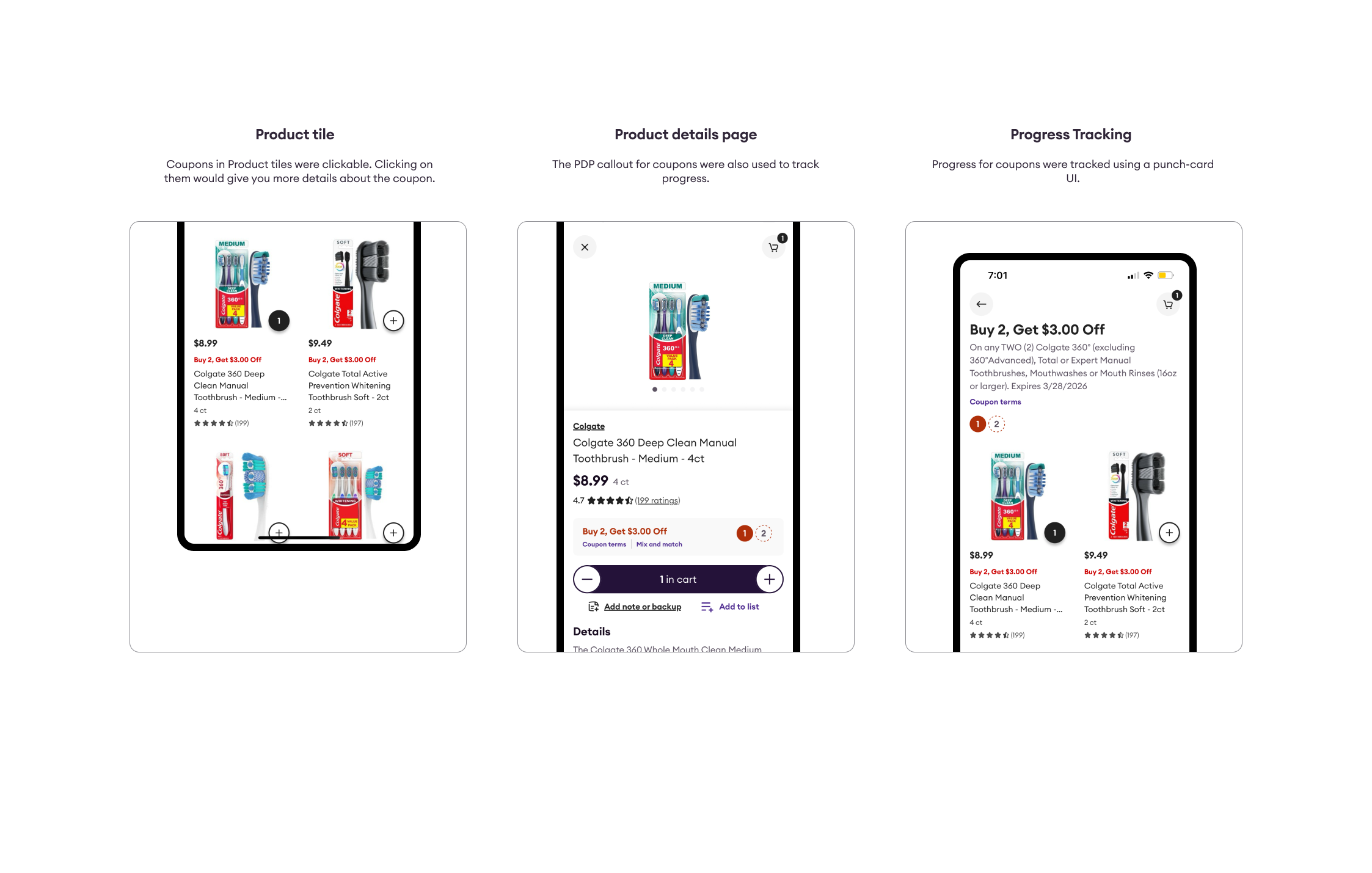
Promotions and coupons looked the same but behaved differently, creating confusion and making it difficult for customers to use savings with confidence.
Progress tracking for multi-item deals was inconsistent across promotions and coupons, with different UI patterns, locations, and behaviors.
And members had no tools to actively find, track, or apply the promos and coupons available to them. Savings on Shipt were something you stumbled into — not something the product helped you pursue.
I shifted the focus from incremental fixes to a comprehensive redesign of how savings work across the platform
1.
Simplified access
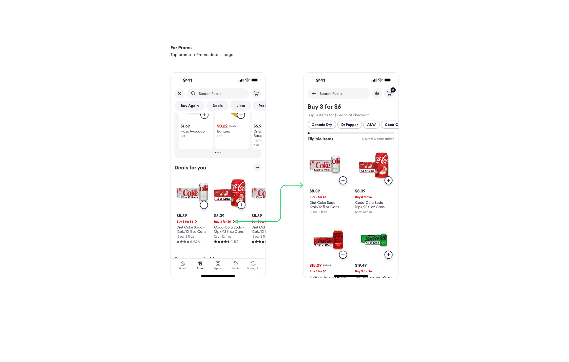
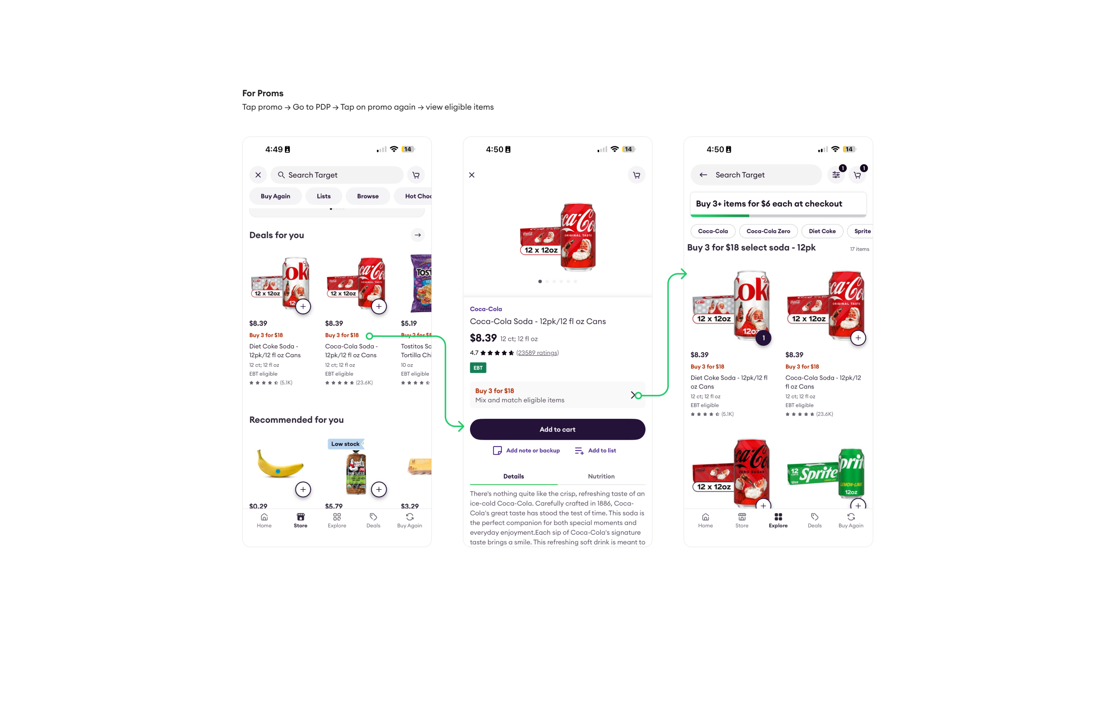
Reduced a multi-step process to two taps, enabling customers to quickly access eligible items directly from the product card.
2.
Unified the experience
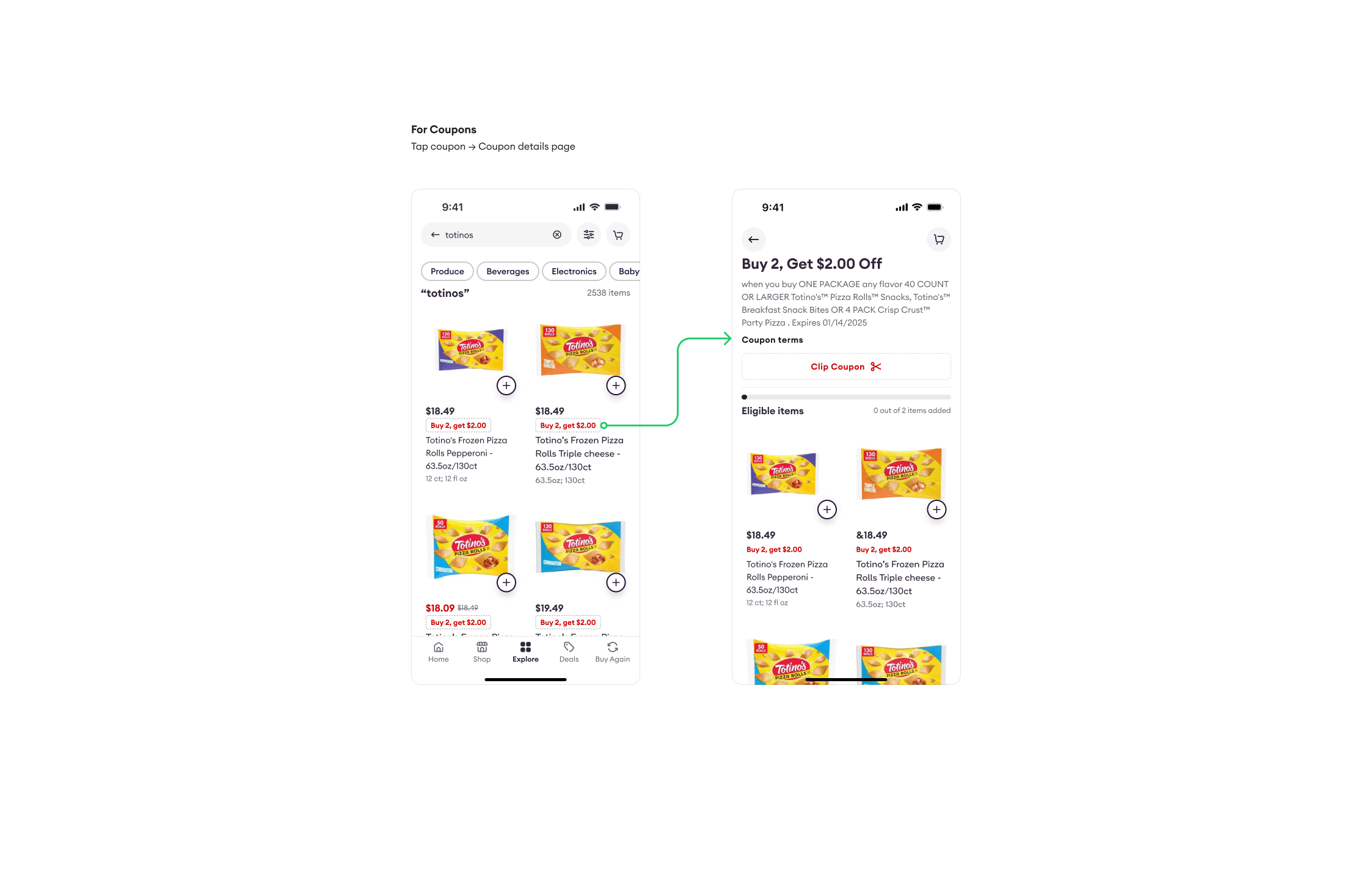
Unified promotions and coupons under a single interaction model, so customers no longer need to learn two separate behaviors.
3.
Surfaced savings proactively
Introduced a proactive savings tracker, showing customers the savings as they shopped, rather than after checkout.
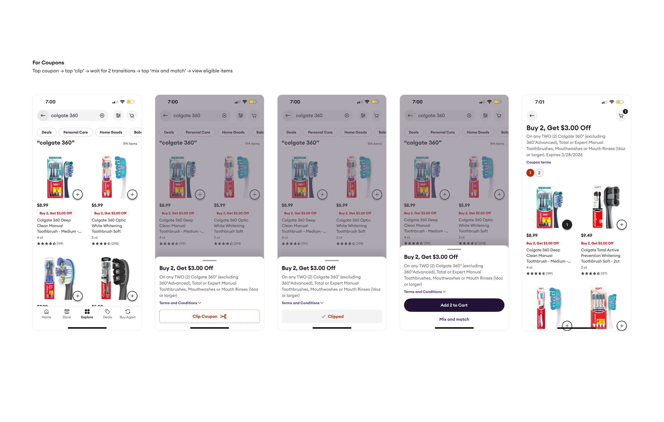
The original flow required tapping the coupon, clipping it, waiting for transitions, tapping mix and match, then viewing eligible items. The redesigned flow: tap the promo or coupon from the product card, see eligible items immediately.
 After
After
 Before
 After
After
 Before
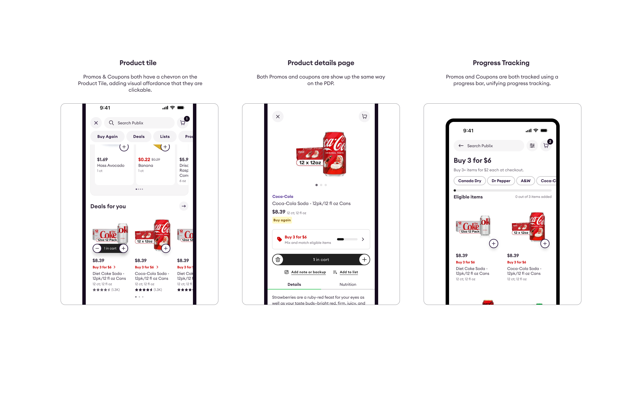
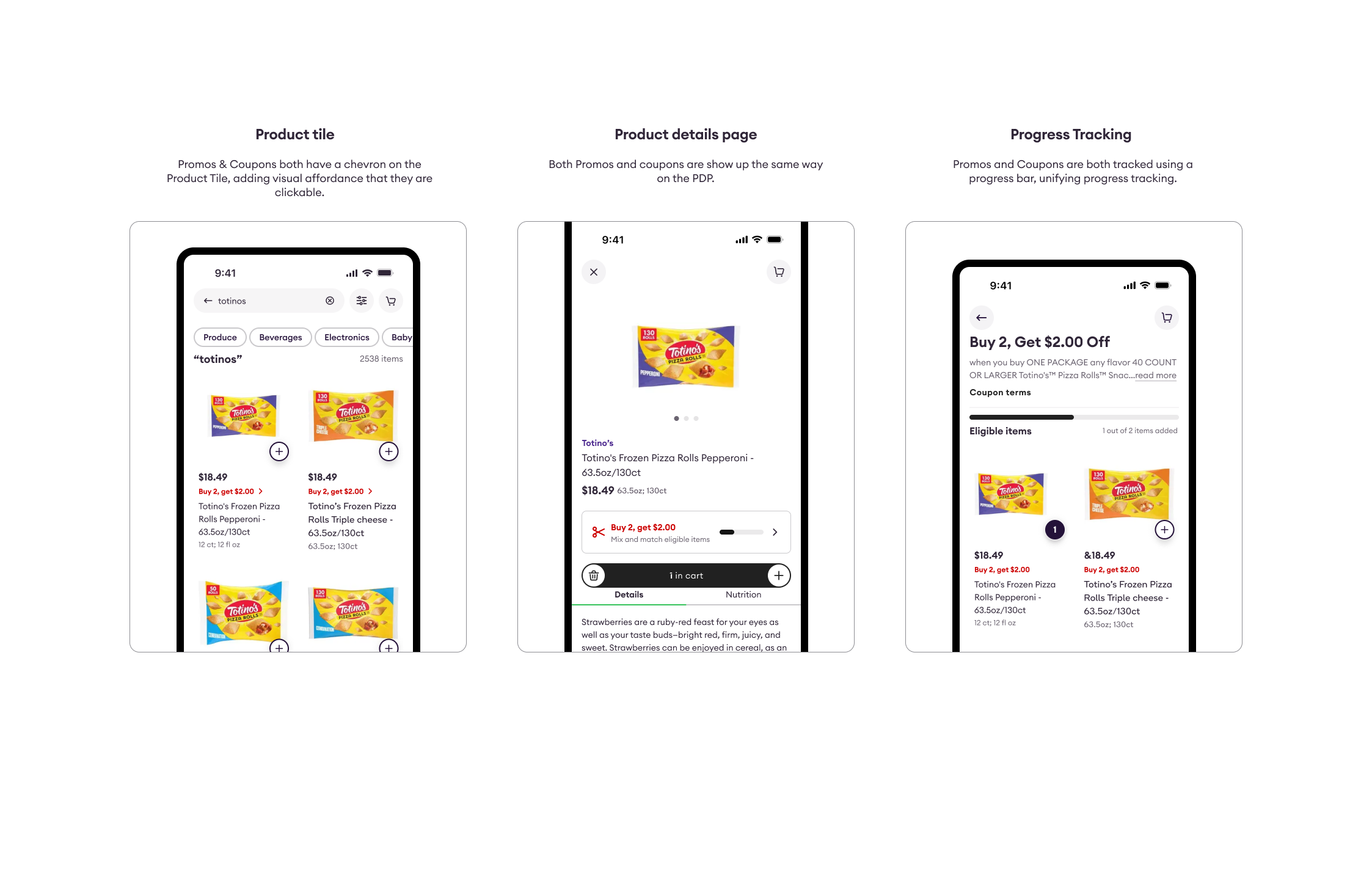
Unified promotions and coupons under a single system: both now display consistent visual cues and lead to a details page showing eligible items immediately. Both now follow the same progress states - default, in progress, complete - on the product page regardless of savings type.
 After
After
 Before
 After
After
 Before
Savings shouldn’t be something members stumble into.
Designed a consistent savings tracker that appears throughout the shopping journey - home page, search results, and cart - surfacing relevant promos, showing progress toward thresholds, and prompting next steps. This turned savings from a passive discovery into an active, guided experience.
The full case study covers the system audit, the complete alignment framework across all promo types, and the design rationale behind the savings tracker.
Coming soon