AI-assisted prototyping with Figma Make
In a delivery app, store tiles are the first thing a user sees when deciding where to shop. Every tile has limited space, and multiple teams want to surface different information in it — promos, delivery speed, loyalty credits, social proof badges, new store labels. The question isn't what to show. It's what not to show, and why.
I led the design of a decision framework that answers that question systematically — a priority system that evaluates 11 attributes across three display slots and determines what earns the space based on value to the user, not which team requested it.
The Problem
We had a 2-slot system with 6 attributes. It worked, but barely. As the product grew, more teams wanted to surface more information — loyalty credits, express delivery times, trending badges, high-value promos. We were heading toward 11 attributes competing for the same limited real estate, with no shared logic for who wins.
Without a framework, every new attribute would require a one-off negotiation between teams. That doesn't scale.
The Core Principle
The value of an attribute determines which slot it earns. Slot assignment is an output of value assessment, not an input. This was the foundational decision — it meant no team could claim a slot by default. Every attribute had to earn its placement by proving its value to the user.
This single principle resolved most of the cross-team tension before it started.
How the Framework Works
I designed a decision tree that every attribute passes through before it can appear on a tile.
First, qualification gates. Is this a legal mandate? Does the user even have access to this attribute? If not, it doesn't display — no exceptions. Then a differentiation check: if more than 75% of stores show the same attribute, it's not helping the user decide. Suppress it.
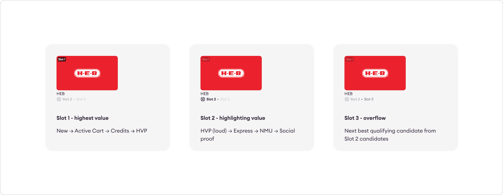
Then, value assessment. Attributes that pass the gates get sorted into tiers — high-value financial incentives, standard financial, time and convenience, and social proof. Each tier maps to a slot and a visual treatment. A high-value promo earns a prominent badge. Social proof gets a quieter default treatment. The hierarchy is explicit: your own money (loyalty credits) beats a store's offer (promos), which beats speed claims, which beats social proof.
Five principles anchor the system:
- Legal mandates are absolute — they can't be displaced.
- Proven conversion wins — the cart icon earned Slot 1 with 28% order conversion data. No demotion.
- Your money beats their offer — personal loyalty credits outrank promotional offers.
- If it doesn't differentiate, don't show it.
- Empty is better than noise — an unfilled slot is fine. A low-value attribute in a prime slot is not.
Making It Tangible with AI
Before the prototype, I needed the decision tree itself. I used Gemini to work through the logic — iterating on qualification gates, debating priority hierarchies, and pressure-testing edge cases like what happens when a legal mandate and a high-value promo compete for the same slot. What would have taken hours of solo whiteboarding became a structured conversation where I could challenge each rule, refine it, and arrive at a locked framework in a fraction of the time.
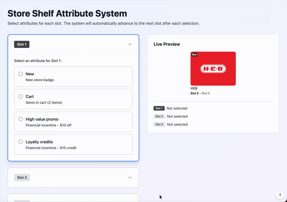
A decision tree on a slide deck is useful. A decision tree you can interact with is convincing.
I used Figma Make to turn the framework into a working prototype. I fed the complete decision logic into the tool, and it generated an interactive component: three accordion panels on the left (one per slot), and a live store tile preview on the right. A stakeholder could select an attribute for Slot 1, watch the Slot 2 accordion open automatically, make a selection, then see the tile update in real time with the correct visual treatments applied.
This prototype became the alignment tool across three teams — product managers and designers from different groups could manipulate the tile themselves and immediately see how the priority logic played out. Instead of debating in a meeting about what should go where, they could test it. The framework went from abstract to self-evident.
What I Took Away
The hierarchy was always the real output — not the visual design of the tile itself. Whether the tile has three slots, two, or one, the question of what earns the space doesn't change. The framework answers that question for any configuration, which is what makes it durable.
And using AI to prototype the decision logic cut weeks out of what would have otherwise been a long alignment cycle. Instead of presenting a static framework and asking teams to imagine how it works, I gave them something to use. That changed the conversation from "I think this should be different" to "I can see how this works."